A creator identity, portfolio and partnership kit built around one idea: a curious eye makes an everyday story worth noticing.
Lifestyle / Places / Everyday rituals
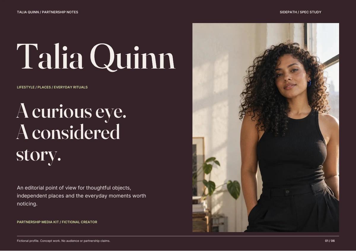
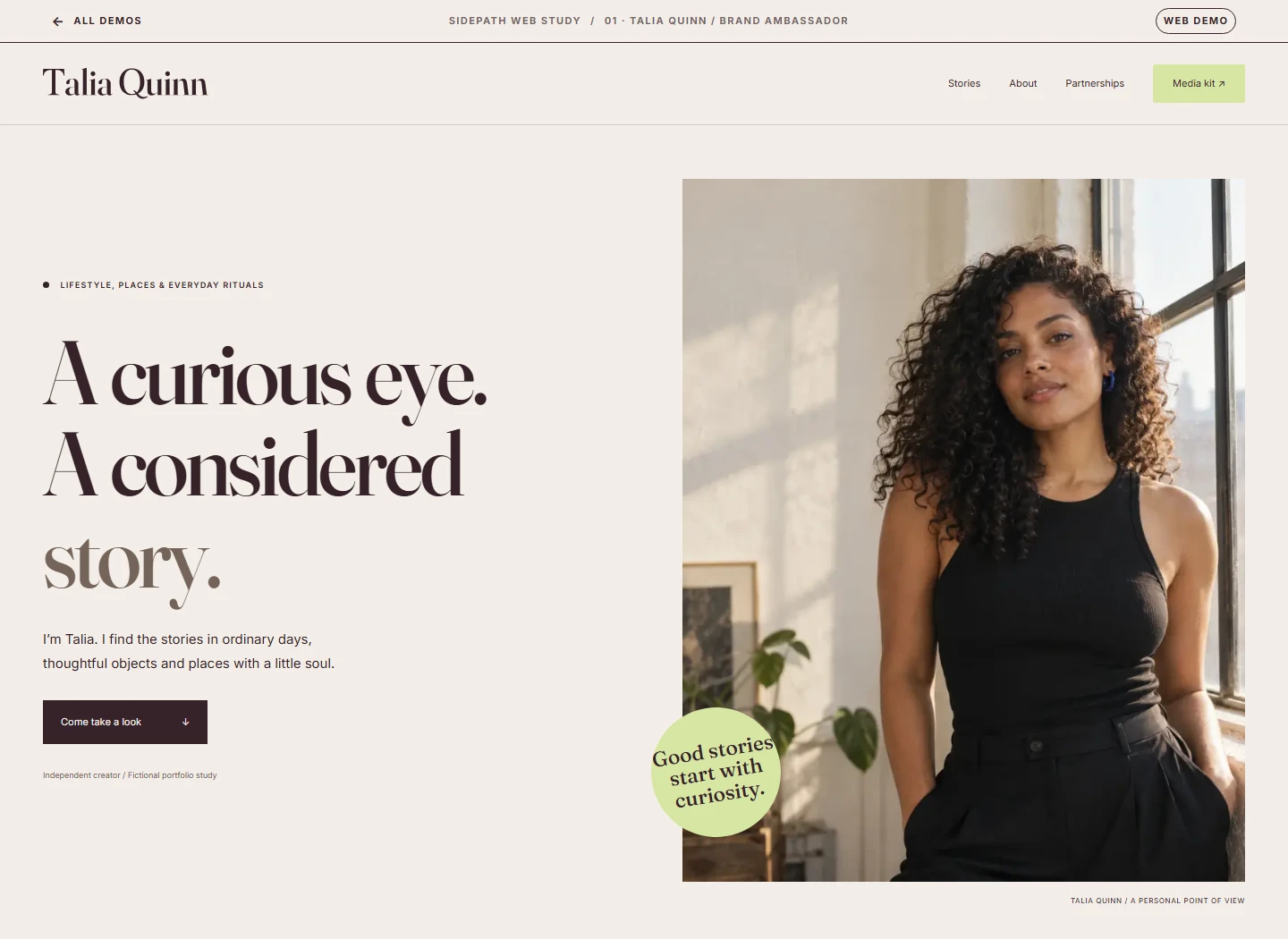
A curious eye. A considered story.
INDEPENDENT CREATOR
The assignment
Make the person memorable. Make the partnership clear.
A brand team needs to understand the creator’s point of view, the work she could make and how to start a useful conversation. A name and an audience number cannot do all three jobs.
Audience
Brand, creative and partnership teams reviewing a lifestyle creator.
The opening
Editorial character with practical information, carried consistently from site to PDF.
Delivered
Outlined identity, six-page media kit, four-page guide, two storyboards and a working portfolio.
01 / Context & references
Learn from the category. Find a voice of her own.
Our reference review looks at how a personal identity connects work, context and contact. These observations shaped the structure and editorial direction below.
Comparable creator practice
Alyssa Coscarelli
Her own profile brings content creation, writing and consulting together. A creator can present several capabilities under one personal identity.
Our design response
Talia leads with her name, then shows concrete story formats instead of a wall of service labels.
Earlier conceptThe earlier signature relied on the unmodified letterforms.Refined directionA rising T crossbar and an extended Q tail give the name a personal rhythm.
Compact signature / 32 px minimum width
Recognizable before it gets decorative.
The signature starts from Fraunces, with a redrawn T, a new Q and optically adjusted spacing. The Q’s tail carries the gesture into an original interlocking monogram. Inter remains the information layer; the personal name leads the introduction.
Master logos are outlined SVGs. Use a minimum name width of 150 px, preserve the proportions and leave half a capital T of clear space around the artwork.
Identity in use
A name, a point of view. In the world.
Creator / Lifestyle & places
A curious eye. A considered story.
01 / A personal introduction
Partnership introduction
Thoughtful stories. Made to be shared.
Identity / Portfolio / Media kit
02 / A compact partnership card
Small-space check
Recognizable when space is limited.
The full name introduces the creator; the TQ signature is a compact companion. These on-screen examples reflect the documented digital minimums.
A warmer alternative to black. The voice and structure.
#F3EEE8
Paper
Quiet space for photographs, stories and practical details.
#D7E6A3
Pear
A fresh editorial note. Navigation and moments of emphasis.
#E7B9A5
Clay
Warmth for social layouts and supporting fields.
Fraunces / Display, weight 500
A curious eye. A considered story.
Inter / Reading & interface
Useful details. Clearly considered.
Clear hierarchy keeps a brand team moving from the story to the practical next step. Supporting text remains readable and calm.
Both families are locally hosted under the SIL Open Font License. Plum carries text on all three light colors; the light colors carry text on plum.
04 / A system that tells stories
The identity has something to say.
Two treatments give the portfolio substance. Each sequence uses one concept photograph, different framing and a simple three-beat narrative. These are storyboards, not completed videos or real brand campaigns.
Story 01 / Everyday rituals
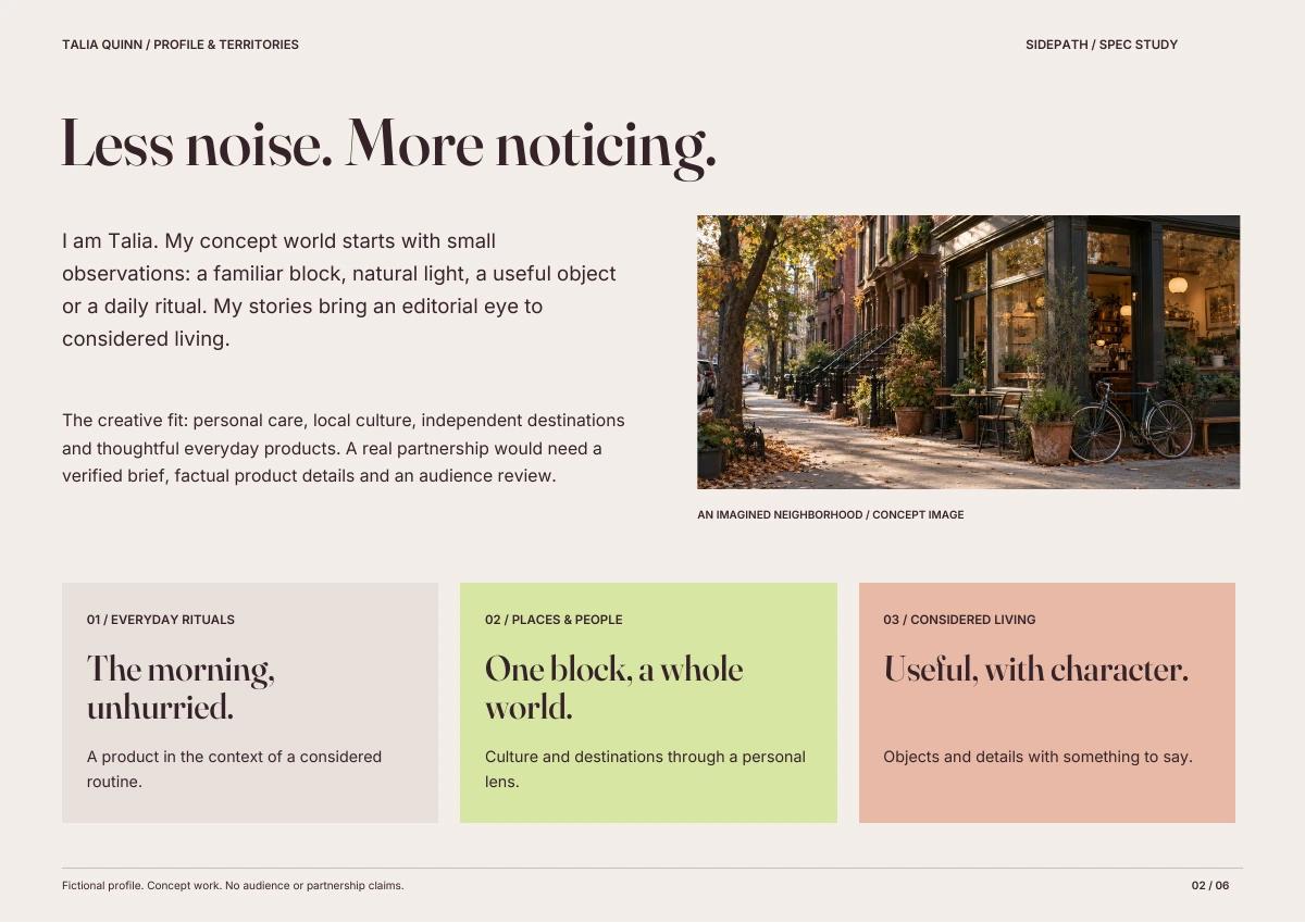
The morning, unhurried.
Give an everyday personal-care product a place in a believable morning ritual. Lead with the moment, then introduce the product as one considered detail.
TQ / STORY STUDY 01
A little room to pause.
01 / Set the scene
Window light, a quiet surface, the beginning of a routine.
TQ / STORY STUDY 01
The things we reach for.
02 / Find the detail
A close product detail, with approved factual copy in a real commission.
TQ / STORY STUDY 01
Take the morning slowly.
03 / Leave a feeling
A simple closing frame that returns to the everyday ritual.
Proposed format: one vertical story sequence and an editorial still. This study delivers the three-frame design and narrative, not a filmed campaign.
Story 02 / Places & people
One block, a whole world.
Introduce a neighborhood destination through the feeling of spending time there. Make a place memorable through small observations rather than a list of selling points.
TQ / STORY STUDY 02
Take the long way.
01 / Arrive
An establishing view of the block, with room to notice the surroundings.
TQ / STORY STUDY 02
Stay for the small things.
02 / Notice
Windows, greenery and the details that make a place feel personal.
TQ / STORY STUDY 02
A place to come back to.
03 / Remember
A closing thought. Real opening hours or recommendations require verification.
Proposed format: a neighborhood photo essay and a short-form story sequence. This study delivers the visual treatment and three-frame narrative.
05 / The partnership kit
One voice. Six useful pages.
A real PDF, with the creator profile, three story territories, two treatments and a briefing checklist. The sample data page explains what a real creator must verify before sharing her audience information.
01 / Cover & point of view02 / Profile & story territories
06 / The digital portfolio
From first impression to a clearer next step.
The live demo carries the same typography, imagery and voice. Visitors can explore both concepts, read their approach and sequence, download the media kit and reach Sidepath to commission a portfolio.
The package includes the two PDFs, outlined color and reversed signatures, PNG exports, the color specification, narrative notes and source references.