A path
of our own.
A sharper identity for an independent digital studio. Built to carry brand identities, creator portfolios and websites with the same clear point of view.
Explore the system
Identity.
Digital.
A way forward.

The brief
Give the studio
a clearer signature.
Sidepath needed an identity that could stand on its own while making room for the brands and creators it works with. The original idea of two routes was worth keeping. The drawing, wordmark and rules of use needed more precision.
Our own studio identity
Symbol, wordmark, type, color and digital applications
Vector masters, usage guide and application files
01 / The idea
Two routes.
One opening.
The inclined bands suggest forward movement. Their stepped inner edges leave a shared passage: a small detail that gives the symbol its own rhythm.
The name carries the weight.
Compact.
Confident.
Precisely spaced.

The wordmark is based on Archivo by Omnibus-Type, with adjusted spacing and a condensed setting. Production logos are drawn as outlines, so their shape stays consistent wherever they appear.
Full color One ink
 Reversed
02 / Color
A clear role
for every color.
Ink
The voice. Type, structure and dark fields.
Paper
The space. A warm, quiet base for the work.
Cobalt
The direction. Links, emphasis and bold fields.
Coral
The signal. A deliberate, occasional accent.
Ink and paper carry the reading. Cobalt provides structure. Coral adds a signal, with dark text or a dark field when it needs to communicate information.
03 / Typography
Presence up front.
Clarity throughout.
Independent
work.
Clear
presence.
Make the next
step easy to see.
Clear words. Considered details. A visual system that helps people understand who you are, what you make and why it matters.
0123456789 / @ & →
Both families are open source and locally hosted. The identity needs no external font service.
04 / In use
A system
with places to go.
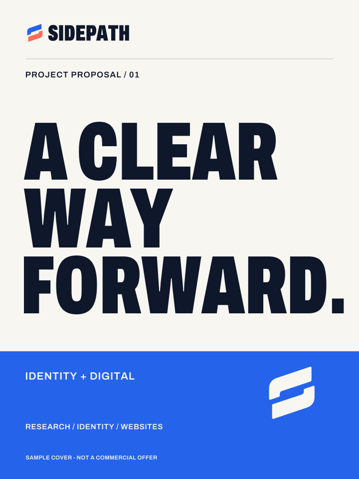
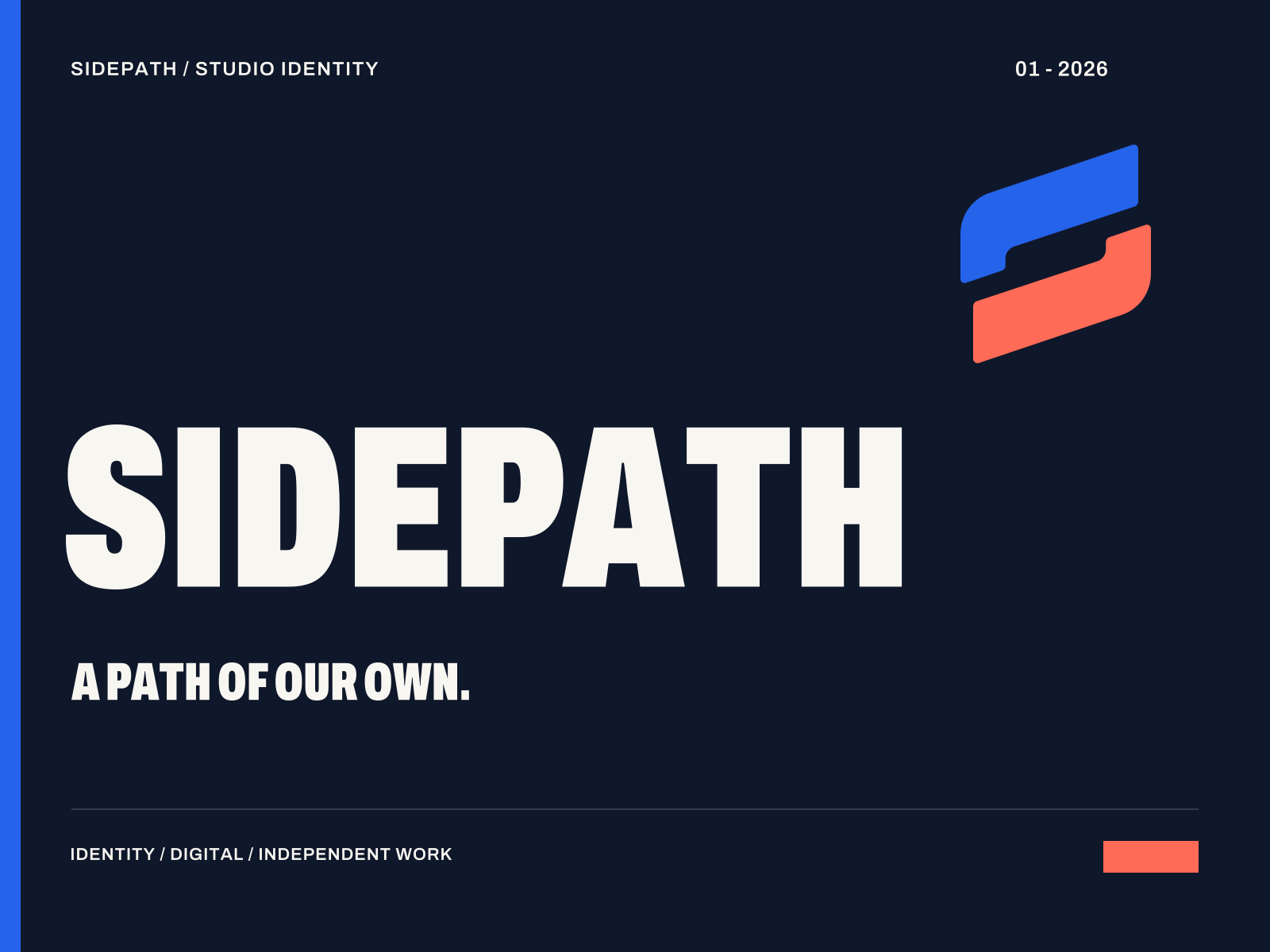
Three applications show how the same elements work across a website, a proposal and a project presentation.
Work Studio Contact ↗Identity and
websites for
independent
people.
A clear way to show what you do.Explore the work ↗
 Ideas / People / A point of view
Built for small spaces.
The right signature
for the space.
The symbol handles compact placements. The horizontal logo carries the name. The full signature adds “Digital Studio” when the size allows it.
16 px24 px32 px48 pxUse the descriptor in larger placements. Keep small signatures simple and legible.
05 / The essentials
Ready to use.
Built to stay
consistent.
The current identity kit includes outlined SVG logos, color and monochrome versions, application covers and a short usage guide.
Download identity kit ZIP ↗Read the essentials PDF ↗Sidepath’s own studio project. The website and proposal applications above are design studies.Identity, made useful.