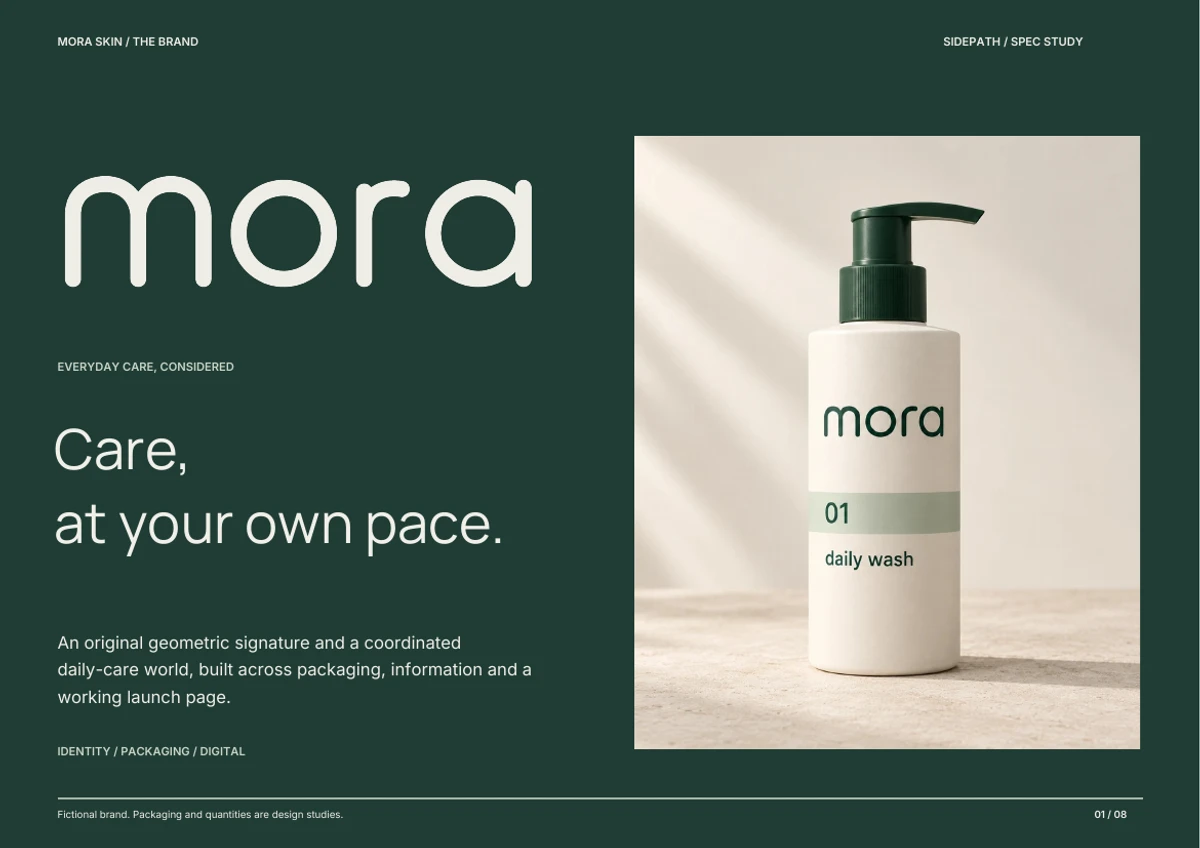
A warmer daily-care world, built from an original geometric signature, a recognizable product family and clear information at every touchpoint.
Mora / Care, at your pace.Packaging direction / Product family
The design brief
Make care feel easier to navigate.
The hypothesis: a daily-care brand can feel warm and considered while keeping product information clear. The intended audience is an adult shopper who wants to identify the product, understand its place in a small collection and find the practical details.
Position
A considered everyday-care concept for a North American audience.
Design problem
The original monogram and serif name did not yet form a distinctive packaging system.
Delivered
Original drawing, two product directions, flat label studies, launch demo and brand book.
01 / The category
Understand the signals. Choose a clear role.
Comparable direct-to-consumer brand
Glossier
Its official story places skin, individuality and expression at the center of the brand.
Our design response
Give Mora an approachable voice, then build a distinct forest-and-chalk system instead of borrowing pink beauty cues.
These sources inform our interpretation. Their teams have not reviewed, collaborated on or endorsed Mora. CeraVe is an established category reference; no market-share ranking is asserted.
02 / The signature
A familiar name. A drawing of its own.
Earlier conceptSeparate symbol, serif name and a small descriptor.Refined directionThe name becomes the primary recognition device.
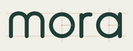
13 / stroke36 / o and a radius52 / m arch spacing
Round forms. A consistent rhythm.
The wordmark is drawn from paths and circular forms. It is not typed in a font. Rounded terminals, open counters and the two arches of the m give the name a soft, steady character.
The M signature comes directly from that drawing. The production files contain vector paths and shapes with no live text or external font dependency.
Primary / 100 px minimum width
Compact / 24 px minimum width
A name at its smallest
Clear on screen. Ready for context.
The wordmark leads where there is room for the full name. The M is a compact companion for smaller placements. These are the digital minimums recorded in the identity guide.
The anchor. Name, reading, controls and dark fields.
#F0EFE8
Chalk
The base. Quiet space for the product and its information.
#C9D6C8
Mist
The first product code. A soft, recognizable wash field.
#C0A074
Ochre
The second product code. A warmer cream field.
Manrope / Display
Care, at your own pace.
Inter / Practical information
Brand. Product. The useful details.
Manrope carries the open, rounded character into headlines. Inter gives descriptors, quantities and supporting information a calmer reading rhythm.
Both type families are locally hosted with their SIL Open Font License notices. Forest is the reading color on all three light fields.
04 / The packaging family
Two formats. One order of recognition.
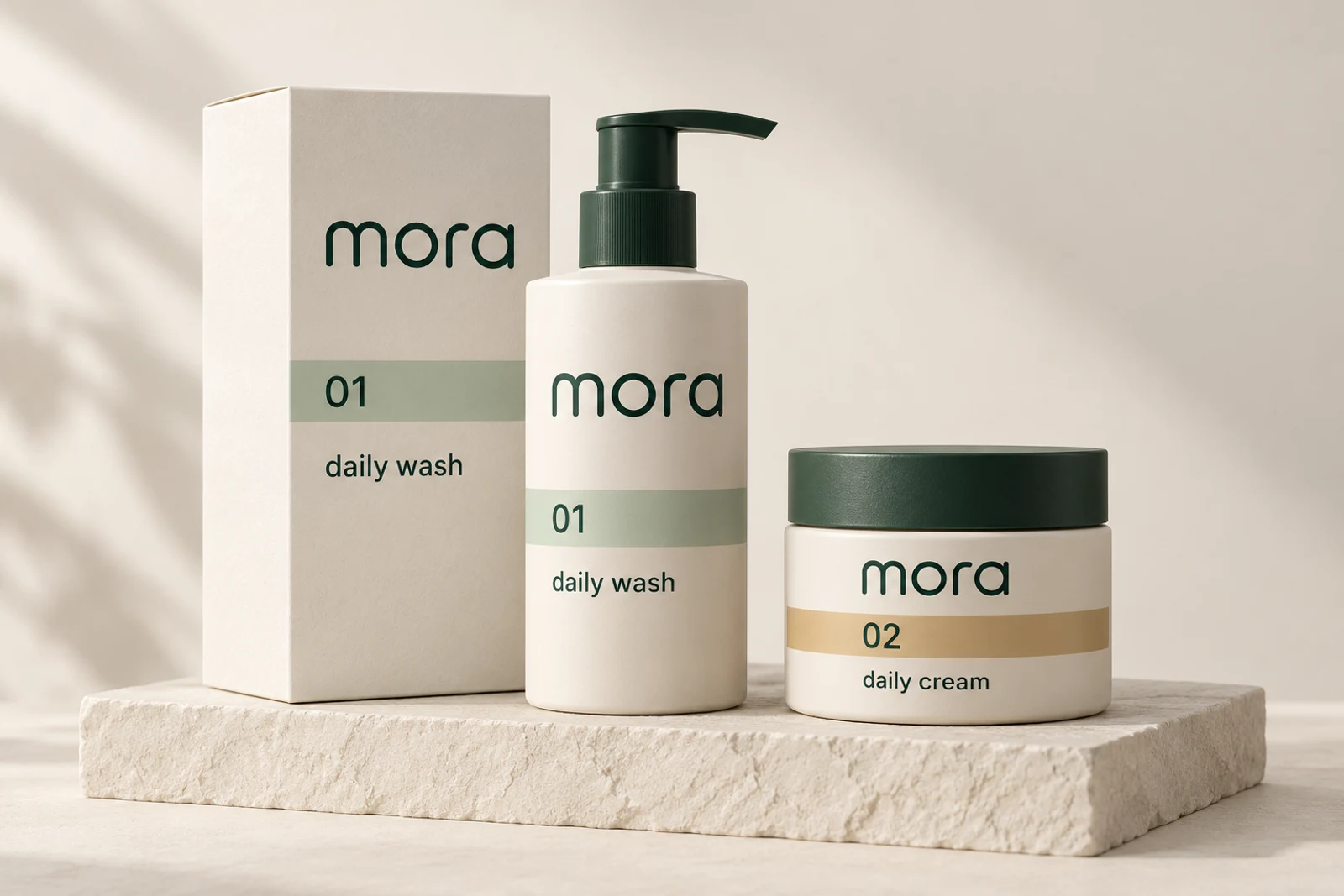
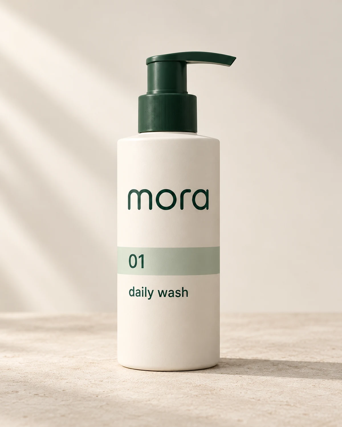
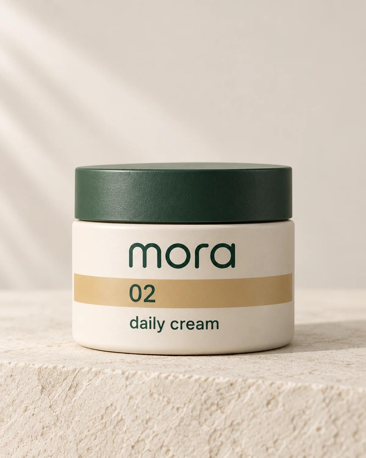
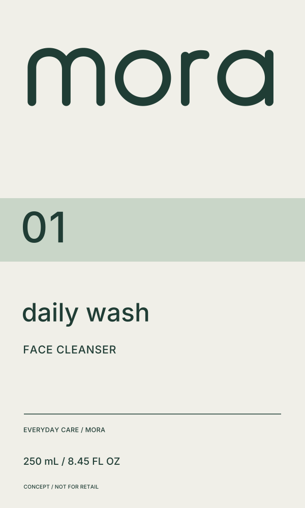
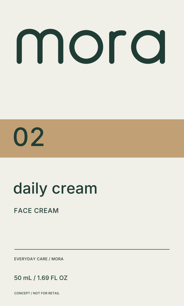
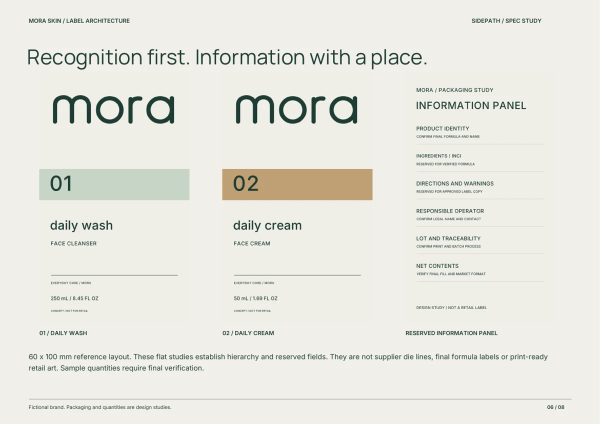
The name stays in the same role. Product number, color band and descriptor identify the variation. Bottle, jar and carton carry the same family without relying on a new symbol for each product. The product images illustrate the direction; the editable labels define the vector artwork.
Editable SVG studies establish a 60 × 100 mm reference layout and the hierarchy of the information. They are supplied as design artwork, not supplier die lines or retail-ready labels.
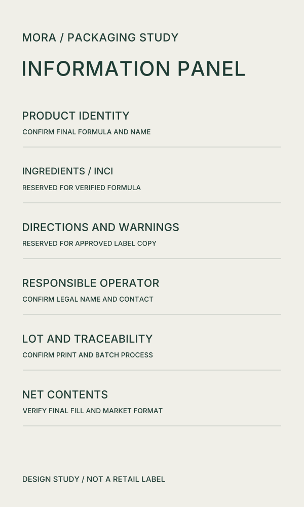
The back panel reserves space for verified product information. Formula, directions and regulatory details require verified content before production.
06 / The launch experience
Let the product lead. Keep the next step clear.
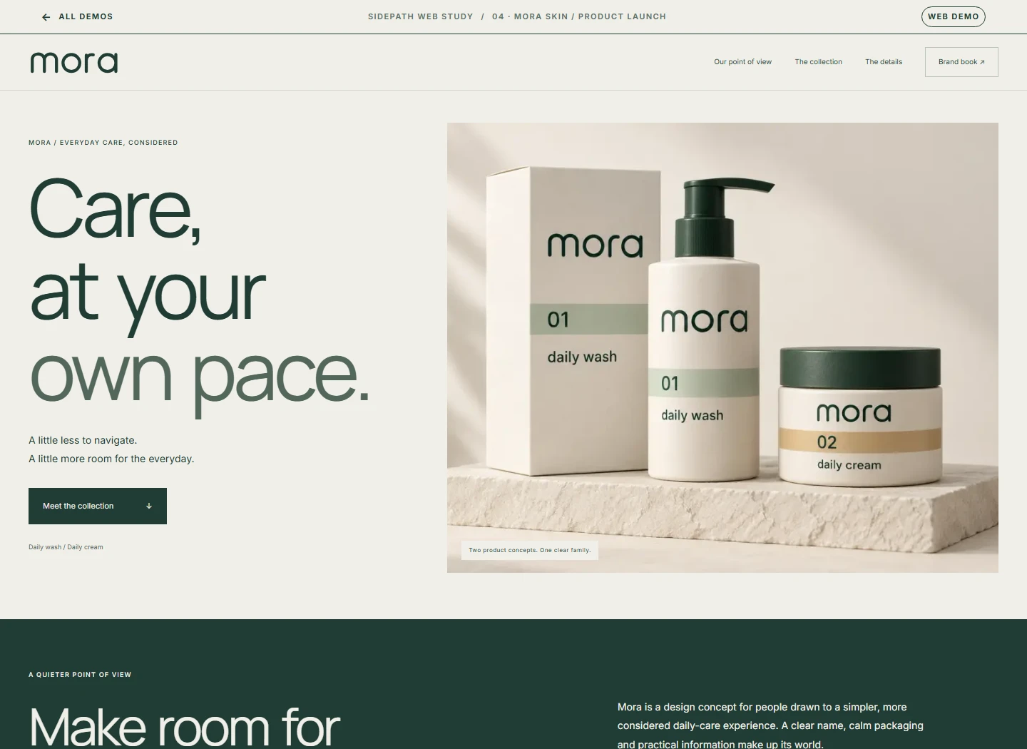
The launch demo brings the same system to the screen. Visitors can switch between product concepts, explore their packaging details, open the flat artwork and read the brand book. Inquiry links lead to Sidepath.
The brand book records the positioning, category references, logo construction, type and color, packaging hierarchy, digital application and delivery limits. The kit includes vector masters, PNG exports and the three label studies.